

by David Levinson from Transportist.org
This text was copied from the source above mentioned. All Rights Reserved
This article is adapted from the book The 30-Minute City: Designing for access, and is about those small local decisions that are often overlooked as planners and engineers focus on major infrastructure policies and programs.
Cities are organised so that many people reach one another in a short amount of time. Residents reach other people, places, goods, and services on foot, or by bike, bus, train, ferry, or car. People don’t need planes or very fast trains to travel between places within a city, even though planes and very fast trains are faster than walking, bikes, buses, trains, ferries and cars. Cities optimise what people can reach in a given amount of time, in the face of modest speeds. We see this when we compare the average speed of travel inside Sydney — about 30 km/h by car after considering traffic signals and congestion — versus the 100 km/h that they can travel on rural highways. Rational people pay dearly to live in Sydney or Melbourne compared to rural Australia. This is not a criticism of Sydney or Melbourne. Despite their extreme congestion the access these and other great cities provide, and the value of that access, is what makes cities great.
Accessibility measures how many potential destinations (jobs, workers, stores, doctors, etc.) someone can reach from a particular point in a given travel time (say 30 minutes) by a particular mode at a certain time of day. The cumulative opportunities measure of accessibility is like the meter or kilogram in the metric system, it means the same thing regardless of where you are. We can talk to a politician and show her how many jobs can be reached from a location in 30-minutes by transit at 8:00 a.m., and we can compare that number with any other point, where the accessibility may be higher or lower. We can compare Los Angeles and San Francisco, or compare Los Angeles in 2019 with Los Angeles in 1973. In Australia, the ’30-minute city’ has been adopted by the Greater Sydney Commission, the planning agency for the Sydney region, as a centrepiece of its 40-year plan. The aim is that residents of Sydney can reach one of three important regional centres in less than a half-hour by walking, biking, or public transport. Doing so requires the thoughtful application of knowledge at hand, using modes of transport technology that have been around for more than a century. This includes wise choices about big investments in subways or elevated highways, and intelligently making small decisions about streets, intersections, and transit stops.
Not everyone works, or needs to get to or from work in a half hour. Different places have proposed 5-, 10-, 15-, and 20-minute neighbourhoods as well. For instance, the ‘pint-of-milk test’ (in New Zealand, the beverage in question isn’t milk) asks whether you can purchase a pint of milk within a 10-minute walk of your home; and a modified version of that test asks if can you do it at a place that doesn’t also sell petrol. The related concept of a 20-minute neighbourhood is about ‘living locally’ by giving residents the opportunity to access all the services they need with a 20-minute round-trip walk, cycle, or public transport trip. While the 30-minute city tends to focus on work and includes travel by motorised vehicles, these other tests ask about life’s other activities and emphasise non-motorised travel. If you can walk to a pint of milk or the local hotel or pub within 10 minutes, and get to your major services within 30 minutes, you are doing better than the average 62-minute trip now experienced by public transport-riding Sydneysiders.
Access and time
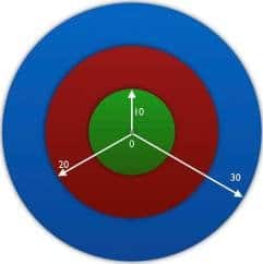
One way to examine accessibility is to measure how much additional accessibility some project or new service will provide. Another way is to examine how much accessibility is lost because an improvement has not been made.Prospect Theory teaches that we feel losses more significantly than gains. So, for example, if destinations reachable in 30-minutes is considered to be 100 percent of accessibility, if you lose 10 minutes of time out of that 30 minutes (because of delay or circuitous routes arising from poor system design), you lose more than half of your accessibility. That loss is so large because accessibility increases as a non-linear function of time. The area of the accessibility ring from 20 to 30 minutes (blue in Figure 1) is much larger than from 0 to 10 minutes (green), or 10 to 20 minutes (red). If we lose five minutes, we lose 30 percent of our accessibility, as shown in Figure 2. Every second counts. Even if a policy or design sacrifices only 30 seconds, this extra delay costs people not only their travel time, but a sacrifices opportunities they could have reached within that travel time.

In busy and crowded cities decisions are made routinely about features of neighborhood streets and transit stops. These might appear to engineers and planners to influence the quality of life in the nearby community. The accessibility framework shows us that they also change our ability to benefit from more distant opportunities by enhancing or reducing access to the entire region. I demonstrate this by presenting three rather different examples of apparently modest urban design and traffic engineering decisions that affected regional accessibility.
The following sections address accessibility changes resulting from the placement of exits at a transit station in Sydney, the design of a Bus Rapid Transit (BRT) line in Minneapolis, and the timing of traffic signals at almost any urban location. While quite different from one another, each illustrates an apparently local decision that turns out to be surprisingly important to people who want to access the entire community.
Access to train platforms
Sydney’s 813 km commuter train system is one of the best in the world, providing high frequency service from many suburbs to central Sydney. However, 44 of 175 stations have entrances at only one end of the platform. A traveler wanting to board or alight the train from the other end of the platform has to walk parallel the station the full length of the platform, which given the length of trains, makes for a 2 minute walk. Figure 3 maps access to Erskineville station. Passenger catchment areas are drawn around the station in 5, 10, and 15 minute bands of walking time. In 2016, some 1,389 people live within a five-minute walk (about 400 metres) of the station platform.
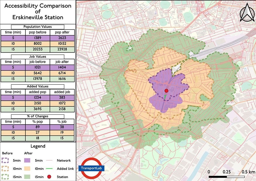
Figure 3: Accessibility comparison of Erskineville station
A long history of research and common sense tell us that people who live near stations are more likely to use public transport than those living farther away. With the current configuration, many people live or work on the wrong end of the platform. The person unfortunate enough to be traveling between two stations both having gates on only one end of the platform averages an extra 3.25 minutes each way, due to the mismatch of their entry and exit locations with their origins and destinations, compared with the ideal case where everything is aligned conveniently.
Erskineville is among the most extreme cases in the Sydney Trains system; 5-minute accessibility to the platform by residents would increase by 89% if a southern entrance were added because there are relatively new, very large, apartment blocks near the southern end of the station. The number of people and jobs within 5-, 10-, and 15- minute walks of the station translates into riders, which translates into land value, which translates into real estate tax revenue. The increase in ridership resulting from an added entrance could produce sufficient revenue that it could pay for itself. There also is an equity rationale for adding the additional entrance. Modern standards for providing access for the disabled require elevators to serve each platform. Elevator installation should be coordinated with additional entrances.
This kind of investment could be made for most of the other 43 stations with similarly lopsided configurations, for which there are not yet plans. And of course, this logic could be applied for similarly configured transit stations in other cities around the world. This is easily-picked low-hanging fruit to improve accessibility that can be done now.
Rapid bus
The Minneapolis – St. Paul A Line, which opened in 2016, is an arterial rapid bus line from suburban Rosedale, providing access to the Green Line and Blue lines of the light rail transit (LRT) system. The A Line is the first rapid bus line in a network planned by the Twin Cities region MetroTransit. Several of its features save a few seconds of time for each passenger at each stop.
- Prepay: Passengers tap on before boarding the bus. This saves 1.5 – 6 seconds per boarding passenger vs. tapping or paying in cash and coins.
- All-door boarding: Passengers can board at any door not just the front. This halves the boarding time.
- Fewer stops: There is longer spacing between stops. Stop spacing increased from about 200 m to about 800 m. This results in less dwell time at stops and less acceleration-deceleration delay.
The faster turnaround results in higher frequency of service with the same number of buses and hours of driver time, so the service is more productive. It’s a win-win change for almost everybody, except for some people who have to walk longer distances to get to or from the nearest bus stops. Figure 4 maps the winners and losers in terms of accessibility, and clearly shows there is many more winners (green) than losers (yellow ). Overall this rapid bus configuration increased accessibility by 5 percent for people who live near the A Line. We could redesign bus networks in many cities to increase access to destinations.
The faster turnaround results in higher frequency of service with the same number of buses and hours of driver time, so the service is more productive. It’s a win-win change for almost everybody, except for some people who have to walk longer distances to get to or from the nearest bus stops. Figure 4 maps the winners and losers in terms of accessibility, and clearly shows there is many more winners (green) than losers (yellow ). Overall this rapid bus configuration increased accessibility by 5 percent for people who live near the A Line. We could redesign bus networks in many cities to increase access to destinations.
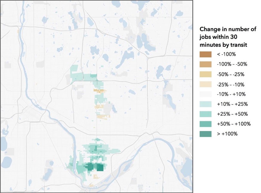
Figure 4: Change in number of jobs within 30 minutes by transit
Rethinking traffic signals
Everyone is familiar with traffic signals. They operate in phases, with green lights given to alternating directions (for instance north-south, then east-west). Traffic signal engineers don’t normally think about accessibility the way I present it here. They think about traffic signal time and vehicle delay.
A traveller in a car approaching a signal faces a cycle which comprises a red indicator, a green indicator, a yellow indicator, and perhaps an all-red period (during which signals are red in all directions). Imagine that a car arrives at this intersection when the light is red. It waits for the red light to change to green before it moves on. There’s a delay associated with that. If cars arrive randomly, the average stopping time is half the red time, and the probability of stopping is the likelihood of arriving when the light is red (the ratio of red time to the duration of the whole cycle).
Traffic engineers apply the same treatment to pedestrians, but the times differ because people on foot systematically get less green time than people in cars. It takes longer to walk across the street than to drive across, so pedestrians are assigned a longer ‘yellow’ period during which the flashing ‘don’t walk’ signal is displayed. Unless a walker arrives during the very brief walk signal window, they must wait. At a rather typical traffic signal, the light indicates ‘walk’ for as few as 6 seconds out of up to 2 minutes. Except for the lucky 5% of pedestrians who arrive during that brief 6 second window, they must wait an average of 57 seconds, and as long as 1 minute, 54 seconds. And that of course assumes the pedestrian actuator push button was depressed on time and registered by the traffic signal controller.
Another source of pedestrian delay is that ‘adaptive’ signals – which adjust green and red time in response to current traffic – give varying amounts of green time to approaching cars, depending on how many are approaching. Thus adaptive signals may extend a phase compared with a fixed time allocation. But pedestrian walk phases are not similarly extended because walkers cannot be guaranteed to clear the intersection quickly enough. There is an obvious inequity with this practice.
I have estimated that the delay experienced by pedestrians because of this is 27% of their time stopped at intersections. At 27% delay due to signals, a pedestrian can reach in 30 minutes what they could reach in 22 minutes if there were no traffic to worry about and no traffic signals to slow them down. Traffic signals were installed for the benefit of people in cars, not people on foot. Pedestrianised districts don’t require traffic signals to ensure walkers don’t bump into each other. As traffic signals were steadily deployed over a century, they increasingly gave priority to cars and pedestrian conditions become significantly worse. I wrote earlier about accessibility loss. A pedestrian losing 27% of her time on a 30-minute walk is losing 8 minutes. This amounts to losing 45% of her accessibility because of waiting at traffic lights. She reaches only just over half as many opportunities as she would in a world without traffic signals, a world like 1920.
We encourage people to walk more and drive less, yet we design traffic signals to favor people in cars rather than on-foot. There are many things that could improve this situation, short of eliminating private car traffic from busy urban districts, which should also be on the table. Pedestrian phases in places where there are many walkers could be automatic, without requiring the push of a button. Instead a pushed button could recall the cycle so the pedestrian phase comes sooner and the pedestrian walk signal is lit for a longer period of time. Smart intersections could sense and count pedestrians automatically. New camera technologies are available but not widely deployed. We could also make much more effective use of the pedestrian actuators to estimate pedestrian flows.
Traffic signals could prioritise pedestrians to give them the maximum rather the minimal amount of green time necessary to cross the street. We could give pedestrians a leading interval, meaning that the walk signal would be lit before cars get a green light to cross their path. This would increase the visibility of pedestrians because they would already be in the right-of-way before cars begin to move. We could provide more “all pedestrian” phases. These are sometimes referred to as a “pedestrian scramble” or a “Barnes dance,” in honor of the New York City traffic commissioner who pioneered their use. The traffic signals could be set on “walk” by default, and only change to “don’t walk” when enough cars show up. These are all things that we could do, but usually don’t. Instead we systematically design traffic signals to be hostile to people on foot throughout most of the United States and Australia.
Changes of these sorts in traffic signal timing would dramatically reduce accessibility loss for pedestrians. Since most transit trips require walking at the start and end of each trip they would make the larger city more accessible within thirty minutes by walking and transit. This would also expand transit ridership, but of course it might impose an accessibility loss on automobile travelers who would have to wait a bit longer at those intersections. As we remake cities to reduce, if not eliminate, automobile dependency, making that tradeoff reduces the existing inequities that favor the movement of cars over pedestrians and cyclists. In addition to fairness, such a change would contribute to reductions in greenhouse gases, air pollution, crashes and other well-known “externalities” that are created by policies that prioritise cars over people.
Cities are made of places, not points
When developing plans for cities or intersections, planners often represent intersections, transit stops, and entire communities as dots on a map. Drawing lines to connect them with new roads, buses, or trains ignores important details. While large scale community plans are very important, we must recognise that, to achieve improved accessibility, the details hidden inside each dot matter. A station is not a point — it’s a place that can be designed for efficiency and equity. An intersection is not a point – it is a space of flows that contains points where people going in different directions, using different travel modes, come into conflict with one another. Those flows and conflicts can be managed differently depending on our priorities and they should be a focus of policy.
We are blinded by regional plans that cause us to see places, small and large alike, as points. We are divided by the deep professional chasms within the transport community – traffic engineers and planners have similar objectives when it comes to safety and equity, but they often fail to communicate effectively with one another. Maps abstract away details, but the map is not the territory. We have ‘big thinkers’ who fail to consider the interaction of small places with their surrounding community, and ‘bounded thinkers’ who narrow the scope of work so much that they don’t think about the interaction of their place with the wider community. Stations are designed so that passengers can exit, while ignoring what happens once they leave the station. The relationship between the station and the neighborhood around it can easily be neglected.
Bus networks are designed looking at how much of the map is within a measured distance of the stops, rather than how easily and how frequently they connect people to places. Many of these misdesigns are not intentional and result from neglect, errors, or oversights. Designs that may have once been fit for the environment they served have not kept up with changes in the world around them. The goals of planners and engineers must change continuously to serve the people who live in the cities they create. Planners, engineers, and — especially — politicians like to focus on building new things rather than repairing, restoring, and reshaping existing systems. Saving time is not pointless. Small amounts of time savings matter at bus stops, traffic signals, train stations, and everywhere else. Small time savings accumulate into large time savings, and increase the number of opportunities that can be reached in a given time budget. Reaching opportunities is why so many people live in cities in the first place.
This article is based on the 12th Annual Martin Wachs Distinguished Lecture in Transportation, given by the author at UCLA in May, 2019. A more extensive discussion appears in the book: The 30-Minute Version: Designing for Access. It is licensed under the Creative Commons BY-NC 4.0 license.
FURTHER READING
Levinson, D. M., & Lahoorpoor, B. (2019). Catchment if you can: The effect of station entrance and exit locations on accessibility. TransportLab
Levinson, D. M., Marshall, W., & Axhausen, K. W. (2017). Elements of Access: Transport Planning for Engineers, Transport Engineering for Planners. Network Design Lab.
Noland, R. B. (1996). Pedestrian travel times and motor vehicle traffic signals. Transportation Research Record, 1553(1), 28-33.
Norton, P. D. (2011). Fighting traffic: the dawn of the motor age in the American city. MIT Press.
Wachs, M., & Kumagai, T. G. (1973). Physical accessibility as a social indicator. Socio-Economic Planning Sciences, 7(5), 437-456.